

Festival Redesign
Graphic Design 1
Summer 2024
This project focuses on redesigning a festival with an ineffective visual identity with the intention of transforming it into a more engaging and successful brand. I chose to redesign Villain Arts Tattoo Festival, as its existing branding felt overly dark, intense, and uninviting.
Tattoos hold deep cultural significance across communities. My goal was to create a visually compelling brand that better represents the depth and artistry of the tattoo community. The following showcases my research, redesign, and rebranding process.
Sketching
I began by defining my core message: exploring the history and cultural significance of tattoos. Tattoos throughout history have long symbolized hierarchy and status in society.
As I learned more, I aimed to make my branding more inclusive—creating a welcoming, less intimidating space for those with tattoos and the tattoo community.
Inspired by historical art, I experimented with integrating tattoos into famous works, blending tradition with modern representation.


Analog Sketches

Moodboard
Digital Refinements
After establishing the concept for my redesign, I transitioned from sketches to digital ideation. This stage is more fluid, as working digitally allows for quick experimentation, and refinement.
I ultimately chose Girl with a Pearl Earring because of its depth and the way it naturally lent itself to the addition of tattoos, creating a contrast between art and modern ink culture.


Creating Branding
To establish a cohesive visual identity, I built a style tile that defined the festival’s new aesthetic.
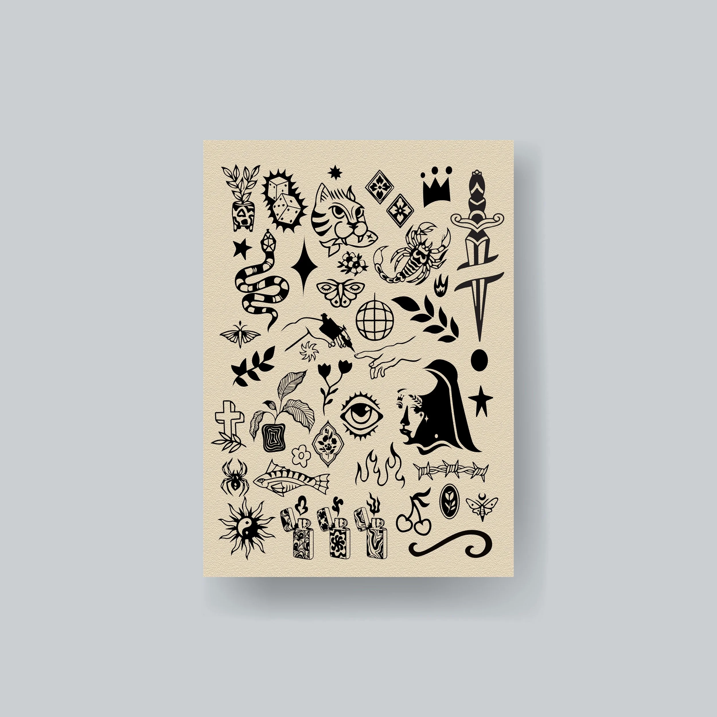
I chose fonts that reflected the artistry and history of tattoo culture while maintaining versatility. I also designed icons, reinforcing the festival’s visual identity.
With these elements in place, I created mockups to showcase the rebranding, ensuring consistency across all touchpoints.

Final Logo

Style Tile
Final Mockups


